Embedded Charts inside an Xcelsius Spreadsheet Table
February 8, 2011 by: David LaiOne of the important features that Xcelsius lacks right now is to be able to embed
charts in a table. This is a very powerful feature as we are able to present a
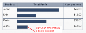
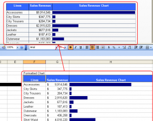
lot of meaningful information with little real estate when embedding charts inside
a table as shown.
In this example I will give step by step instructions on embedding a horizontal bar
chart into a table. This will allow end users to be able to compare values on the
bar making each row visually comparable which adds great value as well as being able
to see other misc table values very easily.
A big thanks goes to Michael Thompson for coming up with a WEBI solution to accomplish
this task if we are using live office. You can visit his blog post here.
The first option is if the number of rows are static. If this is the case, we can
simply put a bar chart underneath the table so it looks like it’s part of the table. We
can then easily bind the chart to the appropriate values.
However this only works if the number of rows are static, the reason being that we
cannot control the synchronization of bar size and spacing with a table that has a
dynamic number of rows.
So now we’ll show how to accomplish this if we are using Live Office or QAAWS.
Note that you can create an object in the universe that will get the same value as the bar length calculation
we will be performing below. But I’ll show you the other options so that you will have a variety of
solutions to choose from.
If using Live Office:
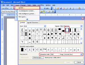
1. Create an emulated bar using a filler character. To get your filler character
ready, Open up Microsoft Word, then Insert -> Symbol. Make sure the Font is (normal text)
and select Character code “2588” from “Unicode (hex)”
2. Now let’s create a new Web Intelligence document.
Choose the eFashion 1998 Universe.
I’ve just chosen a set of lines, sales revenue measure in my query.
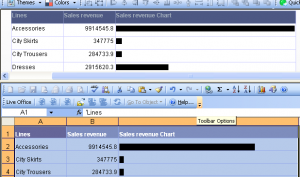
For our table we will have the lines, sales revenue and sales revenue chart as columns
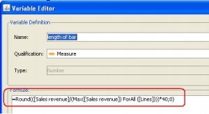
3. Create a variable called “length of bar”
The formula for the variable will be “=Round(([Sales revenue]/(max([Sales revenue]) forall ([Lines]))*40;0)”
We’ll use a multiple of 40 because with 100 the bar is too long.
4. Go back to your temporary Word document and copy the symbol that you inserted.
Now on the Sales revenue column put the formula shown below
“=fill(pasted symbol from Word;[length of bar])”
5. In Xcelsius setup your live office connection and bind the values to a spreadsheet table object and you are done!
If using QWAAS:
Since we can’t do the logic in WEBI, we’ll need to do it in Excel to construct the emulated bar.
The logic is very similar.
1. Create a QAAWS object using the same query that we used in the Live Office Example
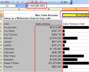
2. On a cell above the QAAWS values that come in let’s get the max sales revenue. We will assume that there are a dynamic
range of rows ranging from 1 to 50 “=max(B4:B54)”
3. Copy the symbol from Word
Now on each row from C5 to C54 put the formula =”rept(“pasted symbol from Word”, round((B5/$C$2)*40,0))”
The rept function is just like the fill function in webi.
Also we are using *40 because with 100 the bar will be too long.
4. Now copy the columns appropriately so that when we bind to the spreadsheet, the formatting looks nice.
That’s it,
Now that you are familiar with how to emulate a bar, you can try creating a bar length object in the universe so you keep
all data manipulations logic in the data layer for best practices 🙂
You can download the source files for the 3 examples here for reference






Very cool! Nice technique!!