Introduction to Inovista Microcharts
October 16, 2009 by: David LaiFor those of you who have seen or used Bonavistas Microcharts on Excel http://www.bonavistasystems.com/. You’ll appreciate how you can show a huge amount of data on the screen without becoming too overwhelming to the end user. Using data tables with sparklines, bulletgraphs, etc puts data in a format where it is easy to read for the human eye.
[kml_flashembed publishmethod=”dynamic” fversion=”8.0.0″ useexpressinstall=”true” movie=”http://www.inovista.com/MovingTitles.swf” width=”500″ height=”250″ targetclass=”flashmovie”]
[/kml_flashembed]
Microcharts for Xcelsius provides us with the advanced table features that Xcelsius lacks. Well there are Xcelsius workarounds that can produce similar results but at the cost of performance, maintainance and formatting problems.
Microcharts is still fairly new so there a few bugs that you will encounter, but if you contact the author, he responds very quickly and is very helpful. In addition, I found that when it first loads with Xcelsius, it takes a very long time. Navigating through the data table properties was a little confusing but once you get used to it, it’s okay. Finally the objects in Microcharts lack the wow effect that the built in Xcelsius objects have.
In this article we will go through an example of the Microcharts data table with items that can be reproducible in Xcelsius and the consequences of using workarounds to produce the same end product. Feel free to play around with the table below by sorting and moving the columns around.
[kml_flashembed publishmethod=”dynamic” fversion=”8.0.0″ useexpressinstall=”true” movie=”http://www.davidlai101.com/blog/media/blogs/bobj/microcharts/datatabledemo.swf” width=”500″ height=”300″ targetclass=”flashmovie”]
[/kml_flashembed]
The example comprises of a microcharts table that has 5 columns. The first column will contain the part type (text). The second column will contain the number of total parts for that part type (number). The 3rd column will contain a monthly trend of defective parts for the part type (sparkline). The 4th column will contain the number of current defective parts (number). The firth column will contain an alert circle where green meets the defect threshold, yellow is borderline, and red falls below the threshold (shape object).
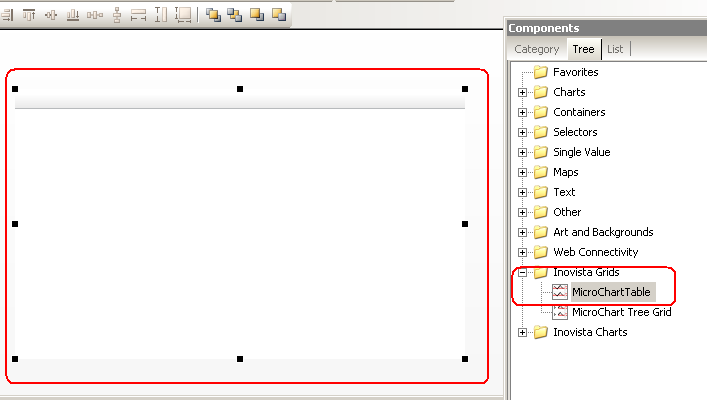
To accomplish this, We would first select the “MicroChart Table” object from “Inovista Grids”

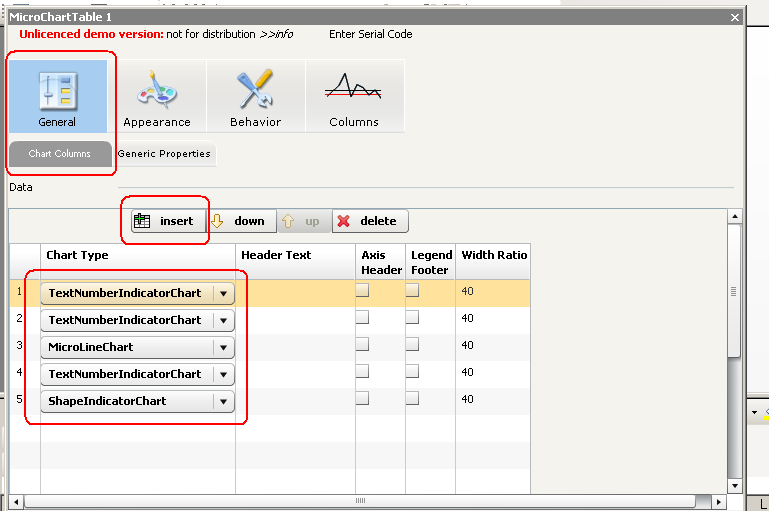
Next we would add the 5 columns. In the properties window, Click on the “General” icon on the top left and the “Chart Columns” tab. Insert each column by pressing the insert button on the Data window. Once that has been completed, we want to change each chart type to the appropriate type and set the header text accordingly. For text and numbers choose the “TextNumberIndicatorChart” type. For sparklines choose the “MicroLineChart” type. Finally for the alert circle, choose the “ShapeIndicatorChart” type.

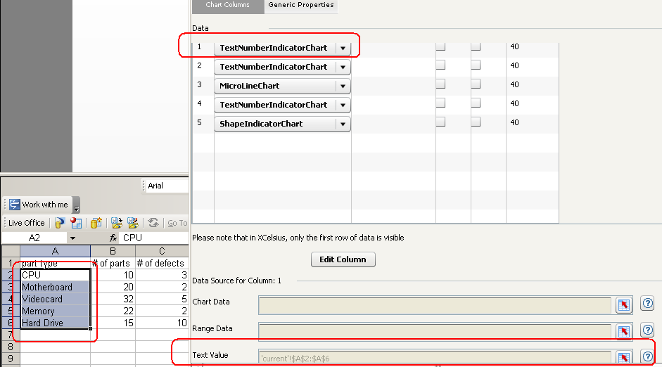
Now we want to set the data values for each column. To accomplish this, just scroll down to the Data Source column and enter your values in either the Chart Data or Text Value sections. Because each column is independant to each other, we can put the data where ever we want on the spreadsheet.

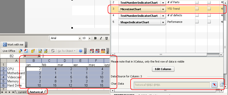
The next screenshot shows how we can further organize our data by putting the sparkline data in a seperate worksheet.

If you notice, we are able to manage multiple columns and charts in just one component in a very efficient manner. Now let’s talk about how we can replicate this using Xcelsius workarounds.
To emulate the table structure we will first need a table object and have the values formatted accordingly on the Excel spreadsheet. You will need to leave blank spaces on the columns that contain the sparklines and alert circles. You’ll notice that it will take a decent amount of time to play around and get the formatting correct.
Once that is finished, you’ll need to create and and setup all the sparkline charts. If you’re table contains 10 rows, you’ll need to create and setup 10 sparkline charts. Just think about how long it will take to fill out the data source values, size the charts and fit them carefully onto the data table.
Finally you’ll need to insert the alert circles and to do this you can simply use the label based menu trick found on Ryan Goodman’s blog. However with this method, the sizing of the label based menu object and table on the design screen is different than what you see when the swf has been exported. Thus when creating scorecards, sometimes you’ll need to spend alot of time playing with the object sizing in order to get things looking correct.
In conclusion, my thoughts on Microcharts is that it provides a powerful addon to Xcelsius on representing data in a manner where users can read what is going on very easily. Although it provides some stress on the development environment, is a little bit buggy, and performance hasn’t really been compared at an enterprise scale level, the benefits that it offers in my opinion outweighs the negatives. The amount of time developers can save from maintaince problems and development time is huge. The author of the product, is extremely responsive to any bug reports and will usually answer or even “FIX” any problems within the same day of contacting the author which is great. As the microcharts plug-in matures, hopefully the bugs will be ironed out and the look and feel will be improved.
In my next article about Microcharts, I will speak about some of the components that users may find very powerful which cannot be emulated using Xcelsius.
You can download the xlf and swf source file here


